
When using Lectora® e-Learning software to create m-Learning, it’s important to consider the usability and navigation of your course. Whether you’re building content for delivery on a smartphone or tablet, remember to design for touch. This naturally applies to buttons, which you’ll want to make “finger friendly”—easy to tap with the pad of your fingertip.There are two ways you can create finger-friendly buttons in Lectora.Custom Radio Buttons and CheckboxesIf you’re using radio buttons and checkboxes in your title, the default controls used in Lectora (which translate to the default controls used by your browser) may be too small for your intended device. In this case, you can take advantage of custom radio buttons and check boxes.To add a custom radio button or checkbox:
1. From the Test & Survey ribbon, select Radio Buttons or Check Boxes from the Customize Controls panel.
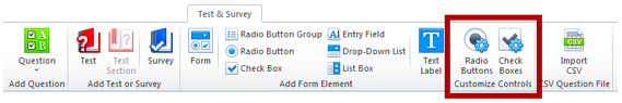
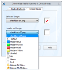
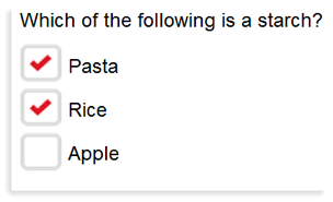
2. On the Radio Buttons and/or Check Boxes tab, choose an image for the selected and unselected state. You can pick from one of the default options listed, or import your own custom image. All you need are two image files (any file format will do—png, jpeg, bmp or gif)—one to show as the unselected radio button/checkbox, and one to show as the selected radio button/checkbox when your learner taps the button.
3. Click OK. Any forms or questions that use check boxes or radio buttons will now automatically use the custom images you’ve defined for your title.
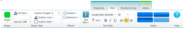
Note that you can also set these custom controls in your Preferences if you want to always use custom controls every time you build a title. You can find the same options by selecting File>Preferences, and clicking on the FormElements tab.Button ObjectWhen using Lectora’s button object, you can use the Style ribbon to customize the button’s shape, background, effects and font formatting.
For example, you can use Lectora to design buttons that comply with the iOS Human Interface Guidelines, Google Design Guidelines and the Android User Interface Guidelines:


To set a specific width and height of a button, you can drag the handles on the adorners of the selected rectangle to resize the button, or use the Position & Size ribbon. Keep in mind that you can select “Offset from Right” and “Offset from Bottom” to create buttons that are always at the bottom of a page, regardless of its length.
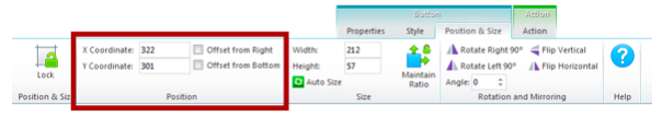
A recent study by the MIT Touch Lab of Human Fingertips to Investigate the Mechanics of Tactile Sense found that the average width of the index finger is 1.6 to 2 cm (16 – 20 mm) for most adults. This converts to 45 – 57 pixels, which you can use as a guideline* when creating buttons in Lectora.For more information on button styles in Lectora 12, check out this blog post on Image, Shape and Button Effects in Lectora 12, and for more information about designing for tablets, you can download or view this How-To Course: Creating Content for Tablets - A Designer’s Guide.*Keep in mind that pixel density can change depending on your device, resulting in a different size of the actual rendered buttons. Always test your content on your intended delivery platform.Sign up for a free 30-day trial of Lectora 12 to try building your own m-Learning with finger-friendly buttons.Subscribe to the Lectora e-Learning Blog for more how-to tutorials and helpful tips.
.svg)
