
Trivantis is excited to announce the release of Lectora® 12 e-Learning software. Our Lectora users are important to us—that’s why this update of your favorite authoring tool delivers the timesaving usability enhancements you’ve asked for! For years Lectora has made it easy to create quality e-Learning authoring quickly (which is why it’s the tool of choice for the Global 2000).
Enhancements include new rotation and cropping tools and more, making it even easier for you to create amazing e-Learning content. Check out what’s new in Lectora 12:
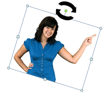
New object adorners allow for the rotation and flipping of shapes, images and text buttons.Alternatively, use the controls in the new Rotation and Mirroring group of the Position and Size ribbon to flip and rotate objects.
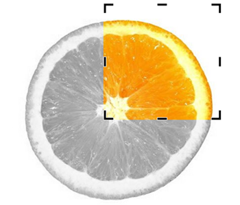
Easily crop images directly on the page to improve the framing or to better highlight the subject matter.
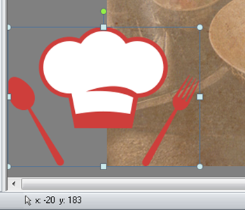
Place objects completely outside of the page boundaries of the publisher. Objects off the page can’t be viewed by your learners—use a Move action to animate the objects onto the page.
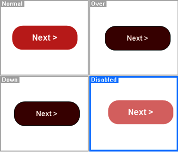
Configure the Normal, Over, Down and Disabled states of buttons. For each state, you change the shape style, or modify the text style. Use the new Set State action to set the state of a button to either enabled or disabled.
Text buttons, transparent buttons (hot spots) and image buttons can be formatted in any shape. You can now create a text button shaped like an arrow or build a rollover with a polygon-shaped transparent button. Once you’ve set your style and properties, you can easily update the shape type directly from the Style ribbon.
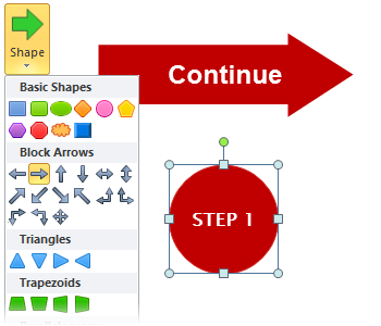
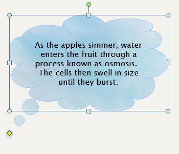
Add text directly inside of a shape or button. You can also select and change the text formatting on the object’s Style ribbon.
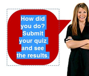
Add star and callout shapes to draw attention to a part of an image or to attract attention to instructions and information.
Change the fill style of buttons and shapes to use gradients, textures or images. Select from a built-in gallery of textures, choose from 26 default gradient styles, customize your own gradient or select an image from the Media Library to design a distinctive button or shape.

You can specify the shadow and reflection settings of shapes, images, buttons and text blocks. You can customize the shadow color along with the transparency, blur, angle and distance settings to create a shadow or blur effect. This also applies to text character shadowing.
Select from new types of bullets and numbering schemes—choose from circles, squares, checks, diamonds and more. When you indent lines of a numbered list, the scheme will automatically update to reflect the new list level.
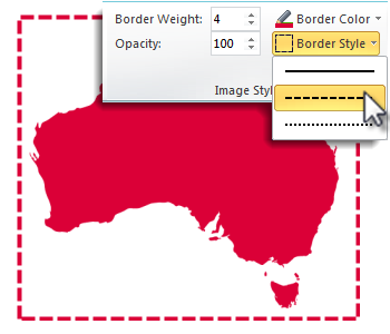
You can add and modify the border style of shapes, images, buttons and text blocks. Determine border color, weight and line style from the object’s Style ribbon.
You can adjust the opacity settings of shapes, images, buttons and text blocks. Use this option when layering text over images so that your text is easy to read, or try blending images together by changing their opacity.

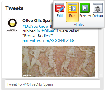
Run mode and Preview mode now provide web-based previews of your content. For instance, you can run JavaScript and preview Web Windows directly from Run mode. Additionally, you can test CSS and HTML extensions and preview text that renders more closely to your browser.
Numbered and bulleted lists are formatted using the current HTML standards. This allows screen reader applications such as JAWS to recognize the text as lists when your title is published to the Web (HTML). Along with lists, status indicators, questions and the table of contents have all been improved for accessibility.
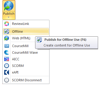
Publish titles for offline use to distribute on external media such as CD-ROMs and flash drives. Alternatively, place the directory on a shared network drive to collaborate with team members.
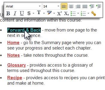
Quickly format text with the Hover Text Menu. The menu will automatically appear when you select letters or words or when you right-click on text in a text block.
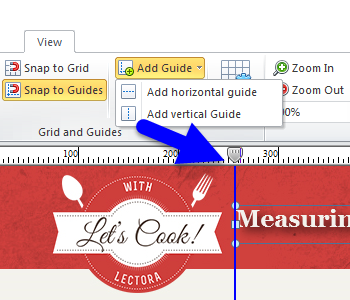
Use the AddGuide and ClearGuide options on the View ribbon to quickly add and remove guides. Use the handles on the ruler to easily move a guide horizontally or vertically on the page.
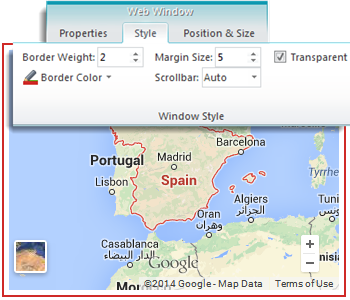
Set a number of properties for Web Window objects including borders, margins, scrollbar and transparency settings.
Snagit® 12 introduced a completely redesigned editor, an enhanced capture experience and video trimming. Learn more here.

With the latest version of Camtasia®, you can accomplish cross-platform screen recording, integrate with Google Drive and record mobile video with TechSmith Fuse, a free mobile app. Learn more here.

Experience how easy it is to create incredible content with Lectora 12—sign up for a free 30-day trial now!
For more product news and Lectora 12 tips, subscribe to the Lectora e-Learning Blog.
.svg)
