You can create custom dashboards and implement them into Advanced Reporting.
By the end of this section you will be able to:
Help you plan what your dashboard should look like and what data it requires.
Understand how to use the dashboard viewer and dashboard editor.
How to add data providers, along with view, filter, and refresh data.
How to add an advanced report data provider.
How to add an archived data provider.
How to add visualizations.
View these topics for more information:
| Starting your dashboard | The steps to starting your dashboard. |
| Using the Dashboard Viewer | Use the dashboard viewer, along with the options available. |
| Using the Dashboard Editor | Add data providers and visualization to your dashboard. |
| Adding data providers | Define the data providers for your dashboard. |
| Adding visualizations | Transform your data with visualizations. |
| Sharing your dashboard | How to configure your dashboard so it can be viewed by others. |
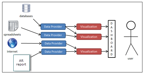
If you are beginning to create a new dashboard, you should already have an idea of what data you need to acquire and how you want to display that data. Dashboards are essentially collections of data providers and visualizations. Data providers capture information from all kinds of different environments. Data providers can return data from a database, the Internet, an Advanced Reporting report, or any number of other places. When a data provider has captured the information, it is able to feed this data to one or more different visualizations. When you have added your first visualization that pulls data from a data provider, you have a viewable dashboard!
When you first click a dashboard from the Dashboard Listing, or when you click the View link next to a dashboard name, you will be presented with the dashboard in the dashboard viewer page. This is the page that the users will go to in order to see the visualizations for a dashboard. From this page, users will also have the option to refresh the data contained in data providers (if the dashboard creator has allowed the data provider to be refreshed), view the underlying data of a dashboard, and apply filters to the data. To get to any of the options below, either click or drag the control panel  gear icon on the left-side of the page.
| Edit |
This button will take you to the dashboard edit page. You will only see this button listed on the control panel if you have access to edit the dashboard. If this button does not appear, you should ask your administrator to grant you edit permissions. |
||
|
Embed |
This button will present you with options to embed your dashboard into another webpage. |
||
| Refresh |
This button will refresh all the data in each of the data providers, and re-draw all the visualizations. Be aware that if your data providers are running database queries, clicking this button will cause each of these queries to run. |
||
|
AUTO UPDATE |
This option will poll the server for changes to the dashboard. This feature is useful if any of the data providers are updated on a schedule or if visualizations change frequently.
|
The Dashboard Edit page will be where you add data providers and visualizations to your dashboard. You can reach this screen by either clicking on the edit link from the dashboard listing page, or by clicking on the Edit button from the Dashboard Viewer control panel.
|
Save / Save and Close |
Remember to save often! Adding a data provider or dragging a visualization onto the canvas does not save your dashboard. You will have to click this button after performing any of these actions if you want to save your changes. This is also true when changing the configuration options for any visualization. Clicking Apply from the configuration screen will not save the changes, you must also click this Save button. |
|
Delete |
Clicking this button will delete the dashboard permanently. You will only see this option if you have permission to delete the dashboard. You can also delete dashboards from the dashboard listing. Click one or more dashboards and then click the Delete icon in the top right of the table (small trashcan icon). You will only be able to delete dashboards for which you have been granted delete permission. |
|
Cancel |
The Cancel button will take you back to the Dashboard Viewer page without saving any of the changes you have made since the last time you clicked Save. |
|
Options |
Edit dashboard name and description - This will allow you to change the dashboard name and description. The changes will only take effect when you save your dashboard. Clear Canvas This will remove all visualizations from your dashboard. |
Data providers are the conduit through which a dashboard receives data from outside sources. These outside sources can be Advanced Reporting reports, external databases, or internet resources. All visualizations will require one or more data providers. You cannot link a visualization directly to an Advanced Reporting report or database, it must go through a data provider first.
To add a new data provider, edit your dashboard, and select either the Add a new data provider link (if you don't already have at least one data provider on your dashboard), or select the  Add a new data provider icon.
When you click to add a new data provider, you will be presented with a list of available data providers.
You can view the raw data returned by any data provider from the Dashboard Viewer page by clicking View Data under the desired data provider. The resulting page will be a Data Table that contains all the raw data returned by the data provider.

|
When using an Advanced Report as a data provider, review Advanced Reports Data Provider. This section explains the View Data further when using a user based filter for the purpose of sharing the dashboard with other users. |
There are several ways to filter your data by either using the ‘filtered data provider’ or using the ‘input control visualizations’. Use the filtered data provider when you want to always have your data filtered a certain way. If you want your users to each have a custom view of the data (a customized filter) you should use User Filters. User filters are created by individual users (dashboard viewers). Your users can access this feature by clicking on the Data button from the Dashboard Viewer page, then clicking Filter under the desired data provider.
When the user clicks Filter, they will be presented with the configuration screen. Here they can setup different criteria for the data returned by a provider. This filter will only affect the user that creates it, and will no effect the view of the dashboard for any other user. This filter will be applied to all visualizations that use the provider for that user.
When you first add a data provider to your dashboard, the data is collected and shared among all users. That data is not refreshed until a user manually refreshes the data, or it is scheduled to refresh on its own. When any user refreshes the data provider, the data is updated for all users. When a data provider is schedule to refresh, the same is also true - the data is refreshed for all users. These are the two options you are presented with for any data provider - Refresh on Demand and Background Refresh. You can configure these options by clicking on the data provider from the Dashboard Edit page. You are also presented with these options when you first add any data provider.
Refresh on Demand
If this check box is checked, it will allow users to refresh data from the Dashboard Viewer page by clicking on Refresh Now under the desired provider. This is useful if you want users to be able to see up-to-date information, but should be avoided if the data provider query puts a significant strain on your database.
Background Refresh
This option will allow you to set this data provider to refresh on its own based on a regular interval. This option is most useful when you have refresh on demand disabled. For data providers that run large cumbersome queries against your database it is best to disable refresh on demand, and enable background refresh to happen when the database is mostly idle (after normal working hours for example). This way, users see data that is up-to-date based on your scheduled interval.
The Advanced Report data provider allows you to take the result set returned by a report and use that data set in visualizations for your dashboard.
To use the results of an Advanced Reporting report in your dashboards, you will first need to create a report. When you have your report, edit your dashboard and select Add a new data provider if you don't have any already or click the add data provider button.
Choose the Advanced Report data provider under the Advanced Report category.
You will now be presented with the data provider configuration page. From here click the Select Report button and choose your report.
You can now fill in the rest of the configuration options.
Component Configuration
| Name | This is the name of your data provider. You will see this name listed when you choose data providers for your visualizations. This name can be different from the report title. |
| Report | This report will supply the data set for this provider. |
| Run time Parameters | Just like setting up a schedule, Advanced Reporting is going to automatically run this report when the data is requested. Therefore, Advanced Reporting needs to know what values you want to enter for any prompts in your report. Remember, if you leave them blank it will skip over that selection! |
| Refresh on Demand |
See the explanation under Adding data providers. |
| Background Refresh | See the explanation under Adding data providers. |
For ALL dashboard visualizations that use an Advanced Report as the data provider, each one must have a User Based Filter created which filters data based upon the user’s CourseMill role. In other words, once you have created an Advanced Report data provider for your visualization, you will need to then add a new custom User Based Filter so the visualization will only show the data which that user has privileges to see.
Step 1 - Create the Advanced Report data provider from an existing report
Step 2 - Create the User Based Filter
All you will need to do is give the user based filter a name (for example, "User Role Filter") and provide the source for that filter by selecting from the Source drop-down list.
Click Apply. You will now see the User Based Filter in the list of data providers.
Step 3 – Change the visualization’s Data source to the user based filter.
For the example being used, the Data source would be User Role Filter.
Now the correct data will be seen by the user based on their role.
Step 4 - For the Advanced Report Data Provider, uncheck the View on Demand and Export on Demand check boxes.
Since a user based filter was added, the users should only be seeing the data from the User Based Filter, not the main Advanced Report. Unchecking View on Demand will remove the View button from the Dashboards Control Panel. The View button for the user based filter will still be accessible and that is the one to which all users need to have access.
The Archived Data Provider allows you to report off of the archived data from one of your reports.
Remember, you must already have an existing report and you should have already archived that report’s results at least when.
When you have your report and your archived date, edit your dashboard and select Add a new data provider if you don't have any already, or click the add data provider icon.
Choose Archived Data.
You will now be presented with the data provider configuration screen.
From here click the Select Report button and choose your report. You can now fill in the rest of the configuration options.
Component Configuration
| Name | This is the name of your data provider. You will see this name listed when you choose data providers for your visualizations. This name can be different from the report title. | ||||||||||
| Report | This report that the archived data comes from. | ||||||||||
| Archives to Select | You have an option on which archives to pull with this data provider:
|
You can use a Microsoft Excel spreadsheet as a data provider. It can be an excel spreadsheet on the Advanced Reporting server, or reachable from there, and the data will respond to changes to the spreadsheet upon refresh. Or you can upload a spreadsheet into Advanced Reporting, and it will be read and used as data to back visualizations in your dashboard.
Path to a Networked or Local Excel Spreadsheet
When using a networked or local (local as in on the Advanced Reporting installation server) spreadsheet, the spreadsheet is read every time a user refreshes the data or a scheduled refresh occurs. This means that updates to your spreadsheet can be transferred to the data provider, and then to KPI's, tables and charts, just by refreshing the data.
The Advanced Reporting application does need to have permission in order to be able to read a spreadsheet on a network location. A spreadsheet stored on the Advanced Reporting server doesn't have this problem since Advanced Reporting is run with administrator. To give Advanced Reporting permission, the Advanced Reporting application/service needs to be run with a network user. A network administrator can provide such a user. The user needs to have read permission on the desired network location, and it needs to have administrator privileges on the Advanced Reporting server. Just as Advanced Reporting requires running with root/sudo or administrator, the network user needs to have administrator privileges on the Advanced Reporting server in order to run Advanced Reporting.
When such a user has been setup by a network administrator then an Advanced Reporting administrator will need to run Advanced Reporting as the user. In Unix, this simply means running startup.sh with the user. In Windows this means running the service with the network user. To do this, right-click the service, select Properties, and switch to the Log On tab. Click the radio button for This account and specify the network user and password that was setup, you'll need to enter the domain as well.
When the user and password has been set, then restart the service. If the service stops immediately, then either the user doesn't have administrator privileges or the user was specified incorrectly. When Advanced Reporting does startup, then you should be able to use an Excel spreadsheet on the desired network location.
When uploading a file, the data is read and cached within Advanced Reporting. This data will always remain the same, until another upload is made. Refreshing either manually or via schedule has no effect.
Component Configuration
| Name | This is the name of your data provider. You will see this name listed when you choose data providers for your visualizations. This name can be different from the spreadsheet file name. |
| Data | How the spreadsheet is read by Advanced Reporting. |
| First Row Contains Column Header |
Describes whether the first row is column headers rather than data to be read. If unchecked column headers will be letters (A,B,C,...) |
| Worksheet Index |
Describes which page in the workbook should be used for the data |
|
|
Only spreadsheets in Excel format may be used. Delimited text files that open in Excel are not the same thing and will not work as a data provider. You can however save one of those files in Excel format and Advanced Reporting can use it. |
Advanced Reporting is capable of connecting with Google Docs and retrieving data from a Google Docs spreadsheet to use in any of our visualizations. By leveraging the Google Data Protocol we can access data stored on the web through Google supplied APIs. To setup this connection to Advanced Reporting you will first have to create a Google Docs spreadsheet, or open an existing spreadsheet in a web browser. For additional help on how to use Google Docs you can visit the Google Docs Help page.
When you have created or opened your spreadsheet, you need to copy the URL, for example:
https://docs.google.com/spreadsheet/ccc?key=0Aup4w7iB-_iWdEh0ZVRNSHRTLUNvVDRya1F6ZC1ZbFE#gid=0
When you add a Google Spreadsheet Data Provider, you will be asked for the key. The key in this example is:
0Aup4w7iB-_iWdEh0ZVRNSHRTLUNvVDRya1F6ZC1ZbFE
If you want to use the URL instead of the key, you must remove any options from the end of the URL:
https://docs.google.com/spreadsheet/ccc?key=0Aup4w7iB-_iWdEh0ZVRNSHRTLUNvVDRya1F6ZC1ZbFE
The filtered data provider is special because it doesn't provide data on its own, but rather provides further filtered data from another data provider. For this reason, you will not see the filtered data provider listed unless you already have an existing data provider on your dashboard.
There are several ways to filter your data and using the filtered data provider is one of those ways. However, you should only use the filtered data provider when you want to always have your data filtered a certain way. If you want your users to each have a custom view of the data (a customized filter) you should use Use Filters. If you want to filter your data for different values as you view your dashboard, then you should use input control visualizations.
Adding an Advanced Report Data Provider
First, you must add a data provider to your dashboard if you don't already have one. See Adding data providers for help with this.
When you have added a data provider, you will now see two additional options on the New Data Provider page: Filtered Data and Analytics.
Choose Filtered Data and fill in the configuration options.
Filter
The filter section is where you define the criteria that the data has to match. First you must decide if you want the data to match all of your criteria or just some of the criteria. When you have selected this, you can add one or more criterion. When you choose a property, the conditions will change to match the property data type. You are allowed to use run time date keywords or user defined fields in this area. You can add or remove criteria by clicking on the + and - buttons next to each one.
Example
The very first thing we will do in this example is add an Advanced Report Data Provider to our dashboard.
Next, we will create a Data Table showing all the data returned by that report:
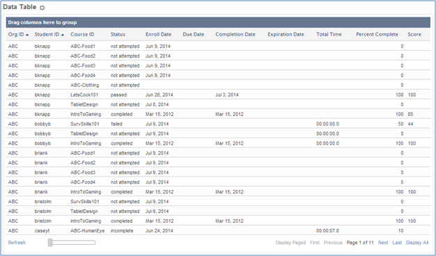
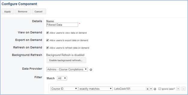
However, we only want to see information for the LetsCook101 course so we add another data provider. This time we add a filtered data provider and give it one criteria that the Course ID must exactly match LetsCook101:
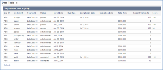
We now go back to our data table configuration, and switch the data provider from the Advanced Reporting report to the filtered data provider, the resulting data table will now look like this:
Filter Chaining
If you need to combine an any and all filter, you can accomplish this by creating a new filtered data provider and selecting your first filter as the data provider for the second filter.
The analytics data provider is special because it doesn't provide data on its own, but rather provides analytical data from another data provider. For this reason, you will not see the analytics data provider listed unless you already have an existing data provider on your dashboard.
First, you must add a data provider to your dashboard if you don't already have one. See Adding data providers for help with this.
When you have added a data provider, you will now see two additional options on the New Data Provider page: Filtered Data and Analytics.
Choose Analytics and fill in the configuration options.
Columns
When you select your data provider, you are presented with a section that looks very similar to the Analytics tab of your report results page. This data provider will allow you to save an analytical view of your data to use in other visualizations.
Example
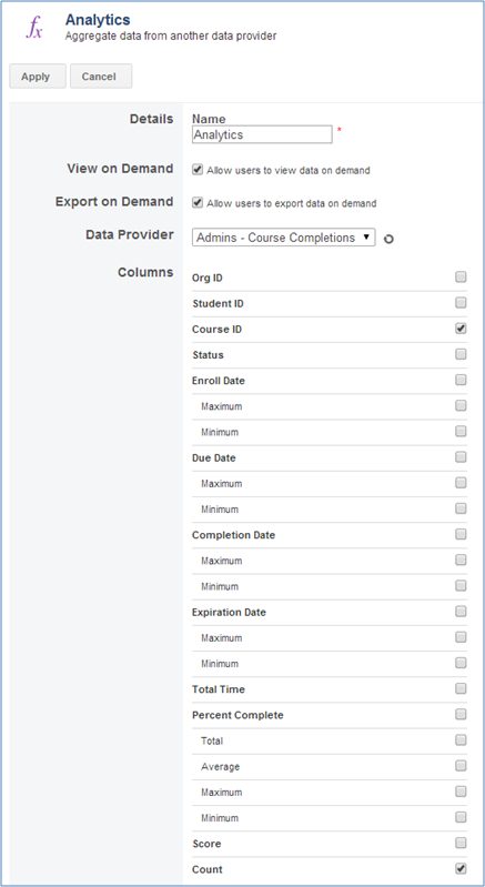
The very first thing will we do in this example is to add an Advanced Report Data Provider to our dashboard.
Next, we will create a Data Table showing all the data returned by that report:

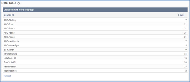
However, we do not want to see each person contained in the data set, we only want to see how many completions for each course. To do this we will add a new analytics data provider using our initial report as the source and enable the Course ID and Count check boxes.
We now go back to our data table configuration, and switch the data provider from the Advanced Reporting report to the analytics data provider, the resulting data table will now look like this:
Visualizations take the data returned by data providers and transforms that data into useful graphics and animations. All visualizations will require one or more data providers. If you have not added any data providers, many of the visualizations will not even show up in the list of available options. Your first step should always be to add a data provider.
To add a visualization to your dashboard, drag the specific visualization from Charts on the left-menu and drop onto the canvas.
Most visualizations will be blank when you first add them to your canvas. You have to configure your visualization before it will show appropriate data. To configure any visualization click the gear next to the title.
The list of visualizations can be broken down into five subsets:
Charts
Input Controls
Layout
Maps
Tables
Many of the component configurations are duplicated from chart to chart so here are the common ones:
| Chart Name | This is the title displayed at the top of the visualization when viewing the dashboard. |
|
Display Options |
Select from the following options:
|
| Chart Type | The type of chart you want to display |
| Data | This is the data provider you will be pulling your data from. In the example below we use an Advanced Report Data Provider, but you can use any type of data provider here. |
| Aggregates | Select either Groups, Individual Rows or One Group. |
|
Label Set |
Complete the following:
|
| Decimal Places | If any of your values contain decimals, you can define how many decimals you want to display here. |
| Baseline | Here you can set the baseline for your chart. The default baseline is zero. The value you set here will be the starting point of values on your chart's axis. |
| Value Set | This will be the value each gauge represents. |
An Advanced Options button has more options for customizing the resulting chart.
| Legend | These options let you set whether or not to display a legend on your chart, and if you decide to show a legend, it gives you options on where to place that legend in relation to the chart body. |
|
Titles |
Select from:
|
|
|
The client browser must have live access to http://www.google.com/jsapi to use most of the charts. |
There are several different Google Chart types:
Gauge Chart
Area Chart
Bar Chart
Column Chart
Line Chart
Pie Chart
The Google Charts Gauge visualization will render one or more gauges in your dashboard. This type of visualization is useful if you are keeping track of a certain activity that has a goal state.
In this example, we are going to track the number of completions based on the completions status.
First we make a report that shows the course completions for the ABC org, for all students and all courses.
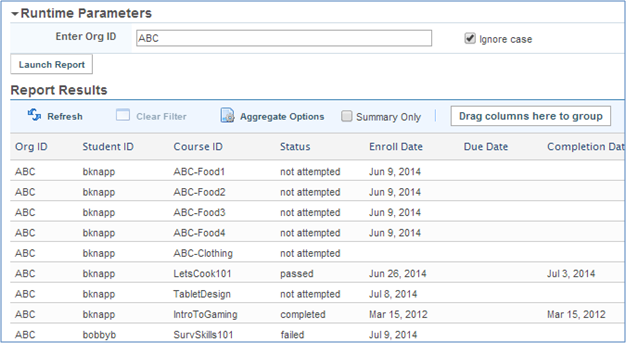
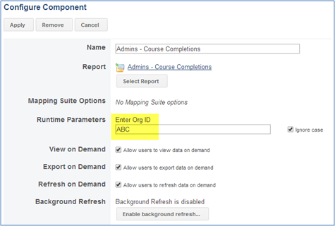
When we have our report, we can add an Advanced Report data provider linking our report to a dashboard. Because we want to see only the ABC org in this dashboard, edit the data provider by selecting the Org ID in the Runtime Parameter as shown:
We are now ready to add the Gauge visualization to our canvas. Select the Google Charts category from the visualizations menu and drag the Gauge visualization into the canvas.
You should now be presented with a blank gauge window.
Click the gear icon next to the gauge title, and you will be presented with the configuration window.
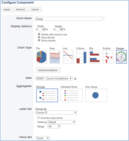
If you click on the Advanced Options button just below the chart type images, you will be presented with more options to customize the gauge visualization.
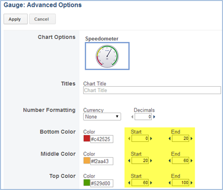
You can set the color thresholds manually by entering a different Start and End threshold number. In this example, we are leaving the default values. After the changes are modified, this is what the gauge will look like:
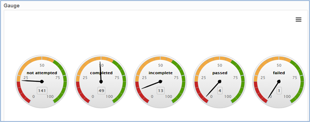
You will need to adjust the width and height of the display to get it to how you would like it to display.
A Scatter Chart is used to map correlation between sets of numbers.
Selecting the Advanced Options button lets you select which type of scatter plot chart you want: Scattered or Stacked.
The Trend Chart is used to make future predictions based on the flow of data for a particular period of time. You can add multiple data series to a trend chart, and have a regression line for each series; but you cannot have one regression line for multiple series.
(See the configure component options under List of Visualizations above.)
Additional components to a trend chart are as follows:
| Period | This is where you choose your time steps for the horizontal axis. |
| Data Threshold | The number of data points your chart will render. This is a limit that charts will graph. Setting this too high and having too many data points may take the browser too long to render all of them. |
| Series |
This section lists the different data series you have tied to this chart. To add a new series, click the New Series button. You can also add new series to this chart by clicking the Chart button on the Dashboard Editor page next to the chart name. Trend Line
|
A Geo Map is a map of a country, continent, or region map with colors and values assigned to specific regions. Values are displayed as a color scale with hovertext for regions. Be aware that your region data has to be formatted in a particular way in order to be interpreted by the Geo Map. Click the question mark next to the Use Aggregates check box on the configuration page to get a list of available formats.
In most cases, you can make a template or script calculated column in your report data provider to get the data in the appropriate format.
Additional Configure Components:
|
Mode |
|
| Regions |
This setting defines the area of the world displayed by your Geo Map. If the specific Region you need is not in the list, select Custom Code and then reference the appropriate ISO 3166-1 code from Google’s list of Continent Hierarchy and Codes at https://developers.google.com/chart/interactive/docs/gallery/geochart. |
The Data Table visualization mimics the report result screen. It shows your data organized into columns and rows. You can sort and group data contained in this visualization just like you would on the report result screen.
Additional Configuration Components:
| Rows | This will be the number of rows displayed per page. |
| Columns | Here is where you designate which columns are to appear in the data table. Any fields you add can be further formatted by clicking the Format button on the right side. |
An Input Control, or Property Filter, is a way to dynamically change the data sets of visualizations by filtering the data on a particular property. This can be any one of the following:
Auto-suggest Box
Date Range
Number Range
Number Slider
Select Box
Text Box
Time Range
When you configure your visualizations, you will have the option set the data source to any pre-existing property filters.
|
Details |
This is the name displayed above the component when viewing the dashboard. |
|
Display Options |
Show Header: Enable or disable the widget header from being displayed when viewing the dashboard. Show Border: Enable or disable the widget border from being displayed when viewing the dashboard. |
|
Width. |
The width of the selection box in pixels |
| Mandatory | Use this to require the user to select or enter a filter prior to rendering data in the associated visualization. If there is a lot of data backing a visualization, it can take a long time to render, and its purpose may be to be filtered in normal usage. This option skips the initial unfiltered rendering until the user picks a filter value. |
|
Source |
Component: This is the data provider you will be pulling your data from. It can also be another Property Filter. Column: This is the property you will be filtering on. |
|
Input Type |
This setting will change the type of Property Filter. When changing the Input Type, make sure your column matches your selection (i.e. make sure you have a numeric column selected if you want a number slider). Auto-suggest Box: This allows the user to select from a list of unique values for the column. Date Range: Rows returned will have values for the column on within the range selected (inclusive). Number Range: Rows returned will have values for the column on within the range selected (inclusive). Number Slider: Rows returned will have values for the column on or after the number selected. Select Box: This allows you to present to the user a finite number of choices which can be filtered on. Text Box: This allows the user to enter their own values with no suggestions. Time Range: Rows returned will have values for the column on within the range selected (inclusive). |
A Property Filter Container is a way to group together like property filters, so that multiple visualizations can be updated at once. A common use case is to be able to have one drop down filter multiple data providers, and update multiple visualizations associated with the choice.
| Display Options |
Show Header: Enable or disable the widget header from being displayed when viewing the dashboard. Show Border: Enable or disable the widget border from being displayed when viewing the dashboard. |
||
| Width | The width of the selection box in pixels. | ||
| Mandatory | Use this to require the user to select or enter a filter prior to rendering data in the associated visualization. If there is a lot of data backing a visualization, it can take a long time to render, and its purpose may be to be filtered in normal usage. This option skips the initial unfiltered rendering until the user picks a filter value. | ||
| Input Type |
This setting will change the type of filters than can be created in the Property Filter Container. All filters within a Property Filter Container have to be of the same input type. For an explanation of each type of input value, see Property Filter – Input Value section above. |
||
|
Input Controls |
Here is where you specify the different filters to be contained in this Property Filter Container. Enter a name for the filter, a component to be used as the data source for this filter, and a property to filter against. The Use values in suggestion list determines if values from that filter will be displayed for things like the auto-suggest box input type. Filters can be added or removed by clicking the plus or minus buttons, respectively. |
||
|
The HTML visualization will render any HTML script in the dashboard area. Useful buttons are offered for formatting if you want to display some simple text or pictures.
The Image visualization lets you upload a picture to the Advanced Reporting web server and display the picture on the dashboard.
| Upload |
Browse for the file you wish to upload. Size limit is 2000 KB. |
| Size |
Actual Size: Select this option to display the picture with its original size Custom Size: Select this option to stretch or skew the picture by a certain number of pixels or percentage. |
The Layout Container is a space for you to put groups of other visualizations. Once you put a Layout Container on a canvas, you can then drag and drop other visualizations inside the Layout Container, including other Layout Containers. By utilizing this visualization you can better customize the look and feel of your dashboard.
All users, regardless of their permissions, will be able to see the Dashboards tab on the Advanced Reporting home screen. However, if they do not have permission to view a dashboard, they will not see that dashboard listed. If you wish to grant a user or group permission to view only a certain subset of dashboards, you will need to edit each of the dashboards and grant the view permission from those dashboards.
As the admin who can create dashboards (admin ID placed in the CourseMill Advanced Reporters with Dashboards group), they will have full control on dashboards.
A user will full control over a dashboard will see the  Permissions button when viewing or editing that dashboard.
By clicking on the Dashboard Permission button, you can set permissions on individual dashboards but it is advised to only share the dashboards when the dashboards have been finalized. Only the admin in the CourseMill Advanced Reporters with Dashboards group should create, edit and delete dashboards. If you allow anyone else these privileges, this will cause problems. All other groups should only have the View permission.
Users with the View permission are able to see a dashboard. It will also allow them to place User Filters on data providers and give them the ability to drill down and see the data underlying any chart on the dashboard.
When creating a dashboard it is important to realize that users who have the View permission for the dashboard will also have access to the underlying data regardless of their other Advanced Reporting security permissions.
You can copy a dashboard by clicking the Copy button in either Edit or View mode. This will bring up a dialog where you can enter a name for the copied dashboard and can also select whether to copy only the data providers or whether to copy the full dashboard (data providers and visualizations). When you have clicked Copy, the copy will begin and you will be redirected to the copied dashboard once the copy has completed.
There are currently two supported ways for sharing your dashboards. The first is by granting permissions to users to view dashboards, which only users with Full Control permission may do, or by clicking the share button, and adding users and groups to the list. Adding users and groups to the share list gives those users and groups view permission.
The second way to share a dashboard is to export an HTML link and embed that link in an existing web page, if you have been granted Embed permission on the dashboard.
To get to the Configure External Links page, open your dashboard, slide the control panel out from the left, and click on the Embed button.
|
Include Viewer Controls |
When you have this box checked, the link will contain a code that allows users to add filters to the data providers, refresh data providers, and view the underlying data set of a dashboard. It may be difficult to notice but each time you check and uncheck the box the Direct Link text and also the Paste HTML to Embed text will be updated to reflect your selection. You can have multiple embedded links for the same dashboard, some with viewer controls and some without - it just depends on whether or not you have this check-box checked at the time when you copy the HTML script. |
|
Direct Link |
The direct link is a URL which you can go to that will show your dashboard, and only your dashboard. The direct link can have viewer controls or not, depending on you selection. You can either bookmark this URL or use it in an existing web page as a link. |
|
Paste HTML to Embed |
The HTML script contained here can be copied and pasted into an existing web page in order to show the dashboard within existing content. This type of link can also have viewer controls associated with it, depending on what your selection was. |
When you are viewing a dashboard it is possible to export data in data providers and drill data from visualizations to most of the export types currently supported by Advanced Reporting. When you click either the View Data button for a data provider or click into a section of a widget to view the drill data, you will see an Export Data option.
This will open a new page where you can specify the export type and other relevant options.
Fill out the appropriate fields and click Export.
You can export to all the same export types as when exporting report results, except for Saved-List and Live Excel. To enable this functionality, select the Allow users to export data on demand option when configuring the data provider.
Support | About Trivantis
© Copyright Trivantis 2017